










Design system

The design system this site is built on. AI agents build with it, so new pages ship fast and still look polished.

Colors

Every interface colour is one of 44 tokens in globals.css, each with a light and a dark value. Canvases, illustrations, the colour picker, the dim behind a dialog and what sits on a picture or a video keep their own. Light page at the left, dark at the right, the values under each.

Source
app/globals.css (:root, .dark), each token's usage in COLOR_TOKENS (components/design/inspect.ts)
Checked by
design:audit (no raw colour), node --test (every token in both themes, every themed colour listed), design:tokens --check (DESIGN.md's tables)

Ground and ink

Every page
…
…
--background

The page

Theo Toussaint
…
Theo Toussaint
…
--foreground

Text, the ink buttons

Product designer
…
Product designer
…
--muted-foreground

Body text, descriptions

Overview
…
Overview
…
--faint

Labels, dates, the nav's words

Surfaces

What sits on the page
…
…
--card

Cards, tiles, the footer ticket

……
……
--secondary, --secondary-foreground

Grey buttons, chips, key caps; the kit's grey button's text

New interface overview
…
New interface overview
…
--placeholder

Frames standing in for pictures

……
……
--primary, --primary-foreground

The kit's filled button, and its text

……
……
--popover, --popover-foreground

Dialogs, and what's in them

…
…
--muted

The kit's hover fills

…
…
--glass

Frosted glass: the composer's shell

…
…
--glass-card

The lighter card inside the glass

ChatPage
…
ChatPage
…
--glass-menu

Menus over the glass, the music player

…
…
--glass-bubble

The radial toolkit's bubbles

Lines

1px, or dotted
…
…
--hairline

1px rings round tiles, panels, glass

…
…
--border

Separators, the kit's outlines

…
…
--rule

The dotted rule

your@email.com
…
your@email.com
…
--input

Field outlines

your@email.com
…
your@email.com
…
--ring

Focus rings

…
…
--shadow

Drop shadows

Signals

Sketches, drops, errors, codes
value proposition
…
value proposition
…
--pen

Sketch mode's ink, words as they stream

…
…
--drop

Files dragged onto the composer

your@email.com
…
your@email.com
…
--destructive

Errors

418
…
418
…
--otp-success-color

The code field's right code

418
…
418
…
--otp-trail-color

The code field's paste

…
…
--verified

The certificate's seal beside Theo's name

PDF
……
PDF
……
--file-pdf, --on-file

The PDF file badge, and its text

Get in touch
…
Get in touch
…
--ink-pressed

The ink button pressed

…
…
--knob

A switch's knob

Design mode

The editor
BenchBee
…
BenchBee
…
--ed-accent

Selection: frames, text, the marker

Hero
…
Hero
…
--ed-component

Components, the agent's pages

…
…
--ed-panel

Design mode's panels

…
…
--ed-canvas

Design mode's canvas

…
…
--ed-line

Design mode's lines

Design system
…
Design system
…
--ed-text

Design mode's text

Foundations
…
Foundations
…
--ed-muted

Design mode's quiet text

Colors
…
Colors
…
--ed-hover

Design mode's hovers

1280
…
1280
…
--ed-field

Design mode's fields

…
…
--ed-handle

A selection's corner handles

1280 × 900
…
1280 × 900
…
--ed-on-accent

Text on a selection's blue or purple tags

Typography

Inter at Regular, −0.04em on every line, its size and its grey doing the work. Caveat for the sketch's notes, the system's monospace for code.

Source
The text styles, --text-* in app/globals.css, and TYPE_SCALE (components/design/inspect.ts)
Checked by
design:audit: a size outside the text styles fails the deploy

Faces

3

Theo Toussaint

Inter--font-sans

Everything on the site, at Regular. Loaded with next/font, its stylistic sets 3 and 8 on.

call to action

Caveat--font-hand

Sketch mode's notes, in the pen's blue, at 20px.

create_frame
System monospace--font-mono

Code: the agent's tools in its steps, the writings' figures. At its own spacing.

Scale

15 sizes
text-heading-4848 / 1.1Case study and writing titles

Putting benched consultants back on billable work

text-heading-3232 / 1.2A case study's section headings, titles on a phone. the case study's is text-heading-32

Benched consultants, back on billable work

text-heading-3030 / 1.2The hero's, the chat's and the contact's titles, the footer's line. text-heading-24 on a phone; the footer's is text-heading-30

Theo Toussaint designs polished products, with design systems written for AI agents.

text-heading-2424 / 1.2The hero's title on a phone, an agent page's section titles. 22 for the section titles on a phone (text-heading-22)

Ask about Theo

text-copy-2020 / 1.3Quotes, the chat's questions

What did Theo do at BenchBee?

text-copy-1818 / 1.4The hero's lead, quotes on a phone. 16px on a phone; quotes are text-copy-18

Teams ship faster than ever with AI. Keeping a product polished at that speed is the hard part. It's what all my work is about, and this whole site was built that way.

text-copy-1616 / 1.4Body. 1.3 by default, 1.4 for reading

I've drawn since I was a kid, and learned mostly from books, James Gurney's and Scott Robertson's among them. I also went through a lot of art books and paintings. That's where my taste started, along with a habit I've kept: looking at the best work out there, and learning from it. Art school was out of budget, so I went to work on events: roadie first, then projectionist, LED technician and media server operator, on video mapping shows from the Mont-Saint-Michel to Doha, including an opening ceremony for 60,000 people in Algiers. Long hours on complex sites, where everything had to work, under pressure. I liked that world, but the pull of creative work came back.

text-label-1515 / 1The nav's words. 14px on a phone
  • Home
  • Works
  • About
  • Contact
text-label-1414 / 1.25Captions, labels, the nav on a phone

Putting benched consultants back on billable workBenchBee

text-label-1313 / 1.2The hero's key line, design mode's chrome. 12px on a phone

Press CtrlK to ask about Theo

text-label-1212 / 1.33Small print, the key line on a phone

Admit oneNº 0001

text-label-1111 / 1A selection's name, key caps, cursors' tags

BenchBeeCtrl

text-label-1010 / 1A project's letter, book covers
B
text-label-99 / 1.2File badges
PDF

Set on all of it

globals.css

polished products

0

polished products

−0.04em
Letter-spacingapp/globals.css

−0.04em on every element, so it follows each one's size: −1.92px at 48, −0.64px at 16. A few set their own: the footer's line −0.03em, quotes −0.01em, code, file badges and sketch notes 0.

BenchBee

Regular 400

BenchBee

Medium 500
Weight

Regular for the text. Medium for Theo's name, emphasis in the chat's answers, and the small labels drawn over things: a selection's name, a cursor's tag, a track's title.

font-feature-settings: "ss03", "ss08"
Stylistic setsapp/globals.css

Inter's stylistic sets ss03 and ss08, on all the text.

Ask about Theo

Titles, 1.2

Putting benched consultants back on billable work

Text, 1.4
Line height

1.1 to 1.25 for titles, 1.4 for paragraphs (1.5 in the chat's answers), 1 for one-line labels like the nav.

0/5 collected1/5 collected

Proportional

0/5 collected1/5 collected

tabular-nums
Tabular numbers

Numbers that change or line up keep one width a digit (tabular-nums): the shelf's count, the ticket's time and number.

Putting benched consultants back on billable work

Off

Putting benched consultants back on billable work

text-balance
Balancetext-balance

A title shares its words evenly between its lines.

Drop the job description for an honest read on whether I fit, including where I don't.

Off

Drop the job description for an honest read on whether I fit, including where I don't.

text-pretty
Prettytext-pretty

A paragraph keeps more than a word on its last line.

Text colours

3 greys of the ink
--faint

Overview

--foreground

Benched consultants, back on billable work

--muted-foreground

BenchBee is a B2B platform for consulting firms. When consultants sit on the bench between missions, firms can share them, anonymously, with other firms that need those skills to unlock a mission, and with recruitment agencies looking for vetted, already-employed consultants.

A case study's sectionspecific · stablepages/case-study.tsx

The label in the faint grey, the heading in ink, the text in the grey that reads.

Layout

One column for the text, wider room for the pictures and the work, the nav and the chat bar pinned to the window. Drawn to scale with their measures in px, on a 1280px computer and a 390px phone.

Source
The widths, --page, --measure, --media, --work in app/globals.css; the pages in components/pages
Checked by
DESIGN.md (Layout) states them; no script checks them yet

Widths

globals.css
--bleed1280100vw

Full bleed: the case study's strip of screens

--work1224min(1600px, 100vw − 56px)

The home page's work, centred

--media1040min(1040px, 100vw − 40px)

Pictures in writings, centred; a case study's run at its column's width

--measure640640px

The longest a paragraph runs, from the column's left; the columns are narrower

--page612min(612px, 100vw)

The column: 580px of text, 16px gutters (Column)

On a computerapp/globals.css

At 1280px wide. Each width is the window's, capped.

--bleed390100vw

The screen

--work358100vw − 32px

The work, one column

--media358100vw − 32px

Pictures: 350 in a case study's 20px gutters

--page390100vw

The column: 358px of text, 16px gutters

On a phone

At 390px wide: everything at the screen less its gutters.

Home

pages/home.tsx
1280 × 900specific · stablesite/hero.tsx, work-grid.tsx

The nav's list and the tools 20px from the top corners. The hero 224px down (the screen's height less 676, from 96 to 336), the work 96 under it at the window less 56, in two columns 20 apart. The chat bar 24px from the bottom, the column's 580 wide.

390 × 844

Everything 16px from the edges. The hero from 184px, under the nav's list; the work 64 under it; the chat bar 16 up.

Case study

pages/case-study.tsx
1280 × 900base · stablesite/media.tsx, case-toc.tsx

A column of 740px at most, 120px from the top, its pictures at the column's width, the opening one wider. From 1280px wide, the column follows the window, half its width minus 32px, the opening picture two thirds of it minus 37px; the contents list sits at the left, 176px from the top.

390 × 844

20px gutters, 200px down under the nav's list; the pictures at the text's width.

About

pages/about.tsx
1280, scrolledspecific · stableabout/photo-strip.tsx

The photos 8px from the top, under the nav. A 400px column 64 under them; from 810px wide each row's label stands in a 133px column at its left, 32 apart, the rows 120 apart.

390, scrolled

The photos under the nav's list from 184px, the column 48 under them, each label over what it holds.

Rhythm

Prose, the pages
120
120
Tablets up
64
64
Phones
Between sectionsbase · stablesite/primitives.tsx

120px from tablets up, 64 on a phone: the home page's sections, the footer. About's rows keep their 120.

16
16
16
24
24
60
8
120
Inside a case studyspecific · stablepages/case-study.tsx

16px from a section's label to its heading and on to its text, 16 between paragraphs, 24 round pictures, 60 before a sub-section, 120 to the next section.

640768810128001600
  • sm 640Rows stacked on a phone sit side by side: lists, the fit report, the secrets' steps
  • md 768Phones below, tablets and computers above: the site's breakpoint
  • 810About's two columns
  • 1280A case study's contents list shows
Breakpoints

Tailwind's md is where most of the site turns; a few parts turn at their own widths.

Shape and surface

The corners, lines, fills and glass the site is drawn with, and its shadows.

Source
The radii --radius-*, shadow-hairline, the glass tokens, in app/globals.css
Checked by
design:audit: a radius outside the 15, or a raw colour in a fill or a shadow, fails the deploy

Corners

Plain arc
Smoothed
Both, a corner ×3
Smoothed cornersapp/globals.css

Where the browser knows corner-shape, every rounded corner is a superellipse and its radius is drawn a fifth longer (--smooth 1.2), close to Figma's corner smoothing at 60%. Elsewhere --smooth is 1 and corners stay plain arcs. Circles and capsules stay round.

xs2
sm4.8
md6.4
lg8
xl11.2
2xl14.4
3xl17.6
4xl20.8
Radius scaleapp/globals.css

--radius-*, from --radius (8px × --smooth): the primitives of components/ui. Buttons and fields rounded-lg, dialogs rounded-xl, media rounded-lg.

2Tooltip arrow
3File badge
4Tiles
5Code, hints
6Keys
8Send
10Buttons
11Buttons, computer
12Rows
13Colour picker
14Fields
16Hovers
18Menus
22Composer
40Phone frames
Radii in userounded-2 … rounded-40

The site writes its radii as tokens named by their size in px (rounded-4), each multiplied by --smooth so it lengthens with the smoothing; a radius outside the list fails the design audit. Small things take small corners: a badge 3px, a tile 4px, the composer's shell 22px.

Shape and surface
Motion
Icons and marks
Outer less the inset
Shape and surface
Motion
Icons and marks
One radius at every level
Nested radiibase · stablechat/composer-parts.tsx

Inside a rounded surface, a corner is the outer one less the inset, so the corners share one centre (Craft, Nested Border Radius): the composer's shell 22px, its card 4px in at calc(22px*var(--smooth)-4px), a row 10px further at 22 − 14. The inset isn't smoothed, so it comes off after.

Lines

Ring
Border
Hairline--hairline

shadow-hairline (0 0 0 1px var(--hairline)): a 1px ring drawn outside the box, so it takes no room and follows the corners. Shown five times larger, the box's edge dashed.

PagesLayers
Rule--rule

A rule between parts of a card or a list: 0.5px in the rule's grey, in design mode's cards and its toolbar, and under the chat's welcome.

Writings
DottedRulebase · stablesite/primitives.tsx

Under a section's name and between rows: dots 2px long every 5px, 1px tall, in the rule's grey.

Picture, outlined
Without
Portrait, outlined
Logo, as it comes
image-outlineapp/globals.css

A faint line inside a picture's edge, black at 10% (white at 10% in the dark), so a pale picture keeps its shape on the page. An outline: it takes no room and follows the corners. Never on logos, which come as they are.

Fills

#f8f8f8 · #2e2e2e
Cardbg-card

The grey a step off the page, for what sits on it as a tile: the footer's ticket, the agent's blocks, the tiles of this page.

#f2f2f2 · #323232
Placeholderbg-placeholder

The grey frame standing in for a picture that isn't there yet: a medium without its file, a photo still to come.

Glass

On a picture, to have something to blur
Glass
glassClassbase · stablechat/composer-parts.tsx

Frosted glass: a thin grey that blurs what's under it by 16px and deepens its colours, edged with the hairline. The composer, the music player and design mode's toolbar are made of it; menus use a denser glass blurred by 20px, design mode's side cards one blurred by 64px.

What did Theo do at BenchBee?
shellClass, cardClassbase · stablechat/composer-parts.tsx

The composer: a glass shell (22px, 4px of padding) and in it a lighter card under the words, which tints the shell's blur rather than blurring again.

Search layers
Motion
Shape and surface
Corners
SIDE_GLASSbase · stabledesign/glass.tsx

Design mode's file card and inspector: the shell's glass blurred further (64px), so the frames under them never read through.

SiteDesign systemAgent
LIGHTbase · stabledesign/glass.tsx

The composer's card without its corners, on its own: the page picked in design mode's sheet on a phone.

What did Theo do at BenchBee?
At rest
What did Theo do at BenchBee?
A file over it
dropzoneClassbase · stablechat/composer-parts.tsx

The composer's card as the drop zone: with a file over it, or a project held over it from the work, its ring turns 2px of the drop blue (--drop, a mid blue on white, the pen's in the dark).

Top edge
Bottom edge
ProgressiveBlurbase · stablesite/progressive-blur.tsx

Eight backdrop blurs, each twice the last, masked in steps so the blur grows toward the edge: under the composer at the bottom of the page. The top edge is drawn for the specimen only: no page blurs its top.

Scroll fades

A platform where IT consultancies place their consultants between missions with other firms and recruitment agencies, used daily by more than 100 of them. I redesigned the whole product in 14 days: 20 user flows and the interface. I anonymised consultant profiles so firms couldn't poach each other's people, and built a design system that developers and AI agents follow, so the team ships faster without losing the look. Zenask built AI agents that sell in coaches' DMs. I designed the whole product on my own, from the strategy to the design system, and it reached $10K in monthly recurring revenue in five months, bootstrapped. One of its key features came from my recommendation: insights drawn from the conversations, each opening the change it suggests. A four-person design and product agency. We started in late 2023 designing for e-commerce brands and influencers: landing pages on Webflow and Framer, Shopify themes built for conversion, Klaviyo email sequences. Then we began automating our own processes and built internal tools for it, and that's how I moved to software. Today we're building a product for organisations that run VAE, the French process that turns work experience into a diploma. I design it, prototype it in code and interview the people who'll use it, 27 so far.
At the top
Scrolled
At the end
scroll-fadehooks/use-scroll-fade.ts

A field or a list that scrolls fades the lines cut at an edge over 28px, only the edges it runs past: useScrollFade marks them (data-fade-top, data-fade-bottom), .scroll-fade masks them, easing in and out over 150ms. The composer's field, the contact form, design mode's lists. The first one scrolls.

Shadows

--shadow: black at 8%, at 32% in the dark
Floating cardspecific · stablesecrets/secrets-shelf.tsx

0 0 0 1px hairline, 0 12px 32px shadow: the card the secrets shelf opens over the page.

Format barspecific · stablesite/design-switch.tsx

0 0 0 1px hairline, 0 8px 24px shadow: the bar over the About page's object while it's edited.

Found it. Click to open.

Pillspecific · stablesecrets/secrets-shelf.tsx

0 6px 20px shadow: the dark pill that says a secret is found.

Miniaturespecific · stablechat/analysis-steps.tsx

0 0 0 1px hairline, 0 6px 16px shadow: the small document the agent reads while it analyses one.

Thumbnailspecific · stablesite/project-row.tsx

0 2px 8px shadow: a project's pictures fanned out of its row.

Tilebase · stablesite/list-row.tsx

0 0 0 1px hairline, 0 1px 2px shadow: the small tile at the start of a list row.

Knobspecific · stablesite/design-switch.tsx

0 1px 2px rgb(0 0 0 / 0.25): the white knob of a switch, and the label under the agent's cursor.

Knob on a videospecific · deprecatedsite/video-player.tsx

0 1px 4px rgb(0 0 0 / 0.35): the scrubber's and the volume's knobs, over any frame of a video.

Colour pickerbase · stablesite/color-picker.tsx

0 0 0 1px hairline, 0 8px 24px shadow: the colour picker, drawn as the format bar it opens from and the site's menus.

Motion

How things move on the site: what a press does, the curves and durations, the page transitions, the springs, and what reduced motion turns off. The demos play under the pointer.

Source
--ease-out-strong in app/globals.css, the curves, durations and springs in the components that move
Checked by
DESIGN.md (Motion) states them; no script checks them yet

Press and hover

Press it
Pressed, 97%
pressapp/globals.css

Pressed, a button shrinks to 97% so it feels heard, over 100ms on Tailwind's ease-out: press transition-transform duration-100 ease-out. What presses as a button can't have its words selected.

Press it
Pressed, 99%
press-softapp/globals.css

Larger surfaces, rows and tiles, shrink less: to 99%, on the same 100ms.

ContraLink
ContraLink, under the pointer
MotionRow
MotionRow, under the pointer
Hoversapp/globals.css

Links and rows change colour the instant the pointer arrives or leaves (Craft, Hover Restraint). Only RollButton eases its fill, over 300ms, as its label rolls. Presses and fades are eased too.

Curves

18 in use · played at 1s to be seen
0.23, 1, 0.32, 1
--ease-out-strongapp/globals.css

The site's ease-out, fast from the start and long to settle: shared elements' morph, the conversation rising in, the composer's height, Motion's entrances (EASE_OUT), design mode's glass.

0, 0, 0.2, 1
ease-outTailwind

Tailwind's, with its durations: every press (100ms), small fades and switches (150 to 200ms), tooltips.

0, 0, 0.58, 1
ease-out, CSS'sapp/globals.css

The keyword, in the page transitions: the new page fading in.

0.42, 0, 1, 1
ease-inapp/globals.css

What leaves: the old page fading out, lifting away to the conversation.

0.42, 0, 0.58, 1
ease-in-outapp/globals.css

The pages' slide, 60px sideways, deeper into the site or back out.

0.25, 0.1, 0.25, 1
easebase · stablechat/composer-parts.tsx

The composer's menus opening and closing (150ms), the scroll fades easing in and out.

0.22, 1, 0.36, 1
Rollbase · stablesite/roll-button.tsx

RollButton's label rolling up (220ms), the code field's light.

0.32, 0.72, 0, 1
Travelspecific · stablesite/fit-result.tsx

Long moves that land softly: the fit check's result travelling (620ms), the paper plane's tilt, a project's pictures flying to the folder.

0.77, 0, 0.175, 1
Strong ease-in-outspecific · stablecontact/contact-form.tsx

The contact form's room closing once the paper plane has flown (600ms), the agent's page in design mode.

0.65, 0, 0.35, 1
Ease-in-outspecific · stablesite/fit-check.tsx

The fit check's document, the agent's pages, the sketch's lines drawing in.

0.45, 0.05, 0.55, 0.95
Sweepapp/globals.css

The marker's stroke, word by word (280ms each), and Theo's cursor moving between words.

0.45, 0, 0.2, 1.04
Carryspecific · stablesite/theo-cursor.tsx

Theo's cursor carrying a project to the chat bar (1.5s), a little past the end and back.

0.45, 0, 0.25, 1
Dragspecific · experimentalpages/agent-page-view.tsx

The agent's cursor dragging a selection over a page it rebuilds (0.8 to 1.6s, by the page's length).

0.4, 0, 1, 1
ease-in, Tailwind'sspecific · experimentalpages/agent-page-view.tsx

A page's content leaving as one, shrinking a touch toward the middle (380ms).

0.44, 0, 0.56, 1
Contentsspecific · stablesite/case-toc.tsx

A case study's contents, the part read turning dark (200ms).

0.25, 0.46, 0.45, 0.94
Detourspecific · stablesite/detour-list.tsx

The detours' pictures fading in under the list (270ms).

1 − (1 − t)⁴
easeOutspecific · stabledesign/canvas.tsx

Design mode's way in and out (350ms): the camera at full speed from the click, settling as it lands.

Quartic, in and out
easeInOutspecific · stabledesign/canvas.tsx

Design mode's camera across the canvas, to a frame or to fit the page (500 to 600ms).

Durations

Short: most things land in under 300ms
  • 100msPresses: press and press-soft, Theo's cursor clicking
  • 120msThe cursor's caret and arrow, where a text can be selected
  • 150msMenus and tooltips opening and closing, the old page's fade, the scroll fades
  • 200msThe chat's welcome rising in, a video's controls, switches
  • 220msRollButton's roll
  • 240msThe composer growing and shrinking with what's in it
  • 250msThe glass leaving, on the way out of design mode
  • 280msThe marker's stroke over one word
  • 350msInto design mode: the camera pulling back, the glass sliding in with it
  • 400msThe pages' slide; the FAQ and the radial toolkit opening
  • 420msA shared element morphing into the next page's; the conversation rising in
  • 600msDesign mode's camera across the canvas; the contact form's room closing
  • 620msThe fit check's result travelling
Durations in useglobals.css, components

Each bar is its duration, from 0 to 650ms. Under the pointer, a dot runs it on the site's ease-out.

Page transitions

ViewTransition, typed on links
Old page fades, blurs
Old page slides 60px
New page fades in
New page slides in
0100200300400
Home
nav-forward, nav-backapp/globals.css

Deeper into the site or back out: the old page fades and blurs out fast while both slide 60px; the new one fades in a little slower, after it. Untyped navigations, a refresh or the browser's back, don't move the page.

Page fades
Page lifts 32px
Conversation fades in
Conversation rises 32px
0100200300400
Home
nav-up, nav-downapp/globals.css

Into the conversation: the page lifts away 32px and the thread rises in on the site's ease-out. Back down, the reverse. Shared elements (.morph: a project's icon, the chat bar) morph in 420ms on the same curve, through a 3px blur.

Springs

Motion, motion/react
400ms to rest
Revealspecific · stablesite/faq.tsx

duration 0.4, bounce 0: No bounce, 400ms: the FAQ opening and closing, the radial toolkit.

450ms to rest
Swing outspecific · stablesite/site-nav.tsx

duration 0.45, bounce 0: The nav's words fanning out from the tools' ring, one row after another.

300ms to rest
Swing backspecific · stablesite/site-nav.tsx

duration 0.3, bounce 0: The same words folding back, quicker, from the last row.

500ms to rest
Turnspecific · stablesite/site-nav.tsx

duration 0.5, bounce 0: The theme's half turning over with it, the radial toolkit turning.

750ms to rest
Rows risingspecific · stablesite/faq.tsx

stiffness 500, damping 60: The FAQ's rows rising 24px into view, each as it enters.

500ms to rest
Fanspecific · stablesite/project-row.tsx

duration 0.5, bounce 0.15: A project's pictures fanning out of its row.

500ms to rest
Settlespecific · stablesite/project-folder.tsx

duration 0.5, bounce 0.18: The sheets settling into the folder a dragged project becomes.

450ms to rest
Followspecific · stablesite/project-folder.tsx

stiffness 520, damping 38, mass 0.6: The folder following the pointer while a project is carried.

500ms to rest
Trailspecific · stablesecrets/secrets-shelf.tsx

stiffness 700, damping 50, mass 0.5: The shelf's bubble trailing the pointer instead of jittering.

950ms to rest
Glidespecific · experimentaldesign/agent-page.tsx

stiffness 120, damping 22, mass 0.9: The agent's page gliding to its place in design mode.

300ms to rest
Digitprimitive · stableui/input-otp.tsx

duration 0.3, bounce 0.2: A digit landing in the code field.

450ms to rest
Releasespecific · stablesite/theo-cursor.tsx

visualDuration 0.2, bounce 0.3: Theo's cursor letting go of what it carried.

Reduced motion

MotionReduced
Presses shrink over 100msThey shrink at once (motion-reduce:transition-none)
Pages slide, lift and morphThey change at once: every ::view-transition animation is off
Motion's transitions and springsThey land at once ({ duration: 0 }); menus only fade
Links to a section glide thereThey jump (scroll-behavior: auto)
The marker sweeps word by wordIt's drawn at once
Loops: the shimmer, the equalizer, the stream's caretThey stand still
A secret's place pings three timesIt's ringed in the pen's blue
prefers-reduced-motionuseReducedMotion, motion-reduce:

With reduced motion asked for, nothing on the site travels: what would move lands where it ends. Colours and opacity still change, so a state still reads.

Sound

Seven quiet cues that say an action was heard, made in the browser with the Web Audio API: no file to load.

Source
lib/sfx.ts: the seven cues, played by sfx(cue) in code or data-sfx on an element (InterfaceSounds)
Checked by
sfx() called with a cue outside the seven fails tsc; a data-sfx one plays nothing

The seven cues

Rendering…
tap…

A way on: a dry tick over a small wooden knock.

Every call to action (RollButton).

toggle-on…

A switch turned on: a bright click, a fifth rising.

Design mode's switch, entering design mode.

toggle-off…

Its mirror: a duller click, the fifth falling back.

Leaving design mode.

open…

A menu opening: a breath going up, a round body rising.

The FAQ, the nav's list, the radial toolkit, the composer's menus.

close…

Its mirror: the breath going down, a small click as it shuts.

The same, closing.

send…

A message going: air rushing up, the body lifting an octave.

A question to the agent, the contact form's message.

drop…

Something landing: a soft thump, a body dropping fast.

A file dropped on the composer, a selection or a project carried to the chat.

How a cue is made

An attackA click of filtered noise, 10 to 130ms: what makes it heard as an action, not a tone.
A bodyA sine or a triangle whose pitch rises or drops: what it means, up for on and open, down for off and close.
A tailSometimes a faint ring an octave or two over, or a tick as it settles.

Pairs mirror each other

What goes up comes back down
toggle-on
toggle-off
toggle-on · toggle-off

The same three layers, the pitch and the brightness turned the other way.

open
close
open · close

The same three layers, the pitch and the brightness turned the other way.

When a cue plays

Craft, Hover Restraint
On a click, or where an action happens in code.A cue answers something the visitor did, so it's heard as theirs.
Never on hover, scroll, typing, focus or a held key.What's done most often gets the least: a held key is heard once.
The same cue within 50ms is heard once.One action, one sound, however many handlers it reaches.
At most -24 dBFS, the most frequent the quietest (a tap about -28).Heard, never in the way.

Every cue

Interface sounds

Each cue is two or three short sources played as one: filtered noise for the attack, a pitched body, sometimes a faint tail. The loudest peak near −24 dBFS.

  • tap

    Buttons that go on: Get in touch, Works, Contact

  • toggle-on

    A switch on: design mode, sketch, dark theme, sounds

  • toggle-off

    A switch off: leaving design mode, sketch, light theme

  • open

    Opening: radial toolkit, nav rings, FAQ, composer menus

  • close

    The same, closing

  • send

    A question sent to the agent

  • drop

    Added to the chat: a project, a selection, files

InterfaceSoundsbase · stablesite/interface-sounds.tsx

Mounted once for the whole site, it draws nothing: a click on anything inside a data-sfx element plays that cue. Below, every cue: press one to hear it.

Icons and marks

Phosphor's icons at the sizes and weights the site draws them, the nudges that centre them for the eye, and the marks and logos, which come as they are: no tile, no radius, no shadow.

Source
@phosphor-icons/react, the optical nudges in lib/optical.ts, the marks and logos as they come
Checked by
ESLint: an import from lucide-react, @tabler/icons-react or react-icons fails lint, with a message saying what to do

Phosphor icons

94 icons, @phosphor-icons/react
  • ArrowElbowDownRight12 · 13 · 16
  • ArrowUpRight7 bold · 9 bold · 16 light · 20
  • ArrowLeft14
  • ArrowRight16
  • LinkSimple14
  • ImagesSquare14
  • SealCheck16 fill
  • Layout16
  • Sun16
  • Moon16
  • PenNib18
  • CaretLeft16
  • CaretRight16
  • EnvelopeSimple16 · 18
  • VinylRecord16
  • Hash10 bold
  • TextB16 bold
  • TextItalic16
  • CaretDown10 · 12
  • CircleHalf14 fill
  • Eyedropper16
  • Warning12 fill
  • Check12 bold
  • X14
Navigation and pagessite/*, pages/*

The nav's parts, the tools, links out, a case study's contents and anchors, the identity's seal, the carousel, the music's record, the editable object of About.

  • ArrowUp14 bold · 16 bold · 16 · 18
  • Stop12 fill
  • NotePencil14 · 18
  • Paperclip16 · 18
  • ArrowsOutSimple18
  • ArrowsInSimple18
  • Microphone18
  • CaretDown12
  • Check14
  • X12 bold · 16
  • ArrowUpLeft14
  • Plus7 bold · 16
  • MagnifyingGlass12
  • Sparkle12 fill · 14 fill
  • Article14 · 16
  • Image14 · 16
  • Quotes14 · 16
  • FileText20 · 24 light
  • SpinnerGap16
  • WarningCircle16
  • Stack20
  • SealCheck20
  • Cube20
  • Sparkle20
  • GlobeHemisphereWest20
  • MagnifyingGlass20
  • Browser20
  • Path12 bold · 20
  • IdentificationBadge20
  • Lightbulb20
  • ChatCircleText20
  • ClipboardText12 bold
  • SquaresFour12 bold
  • EnvelopeSimple12 bold
  • ChatsCircle12 bold
  • BookOpenText12 bold
  • FrameCorners12 bold
  • PencilSimple12 bold
  • Eraser12 bold
  • Diamond12 bold
  • Wrench12 bold
Composer and chatchat/*, assistant-ui/*

The composer's buttons and menus, the conversation's history, the selection's chips, attachments, the starters' topics (20px) and the reasoning's tools (12px, bold, in a 20px ring).

  • Shuffle16 bold
  • Rewind22 fill
  • Play18 fill · 24 fill · 28 fill
  • Pause18 fill · 28 fill
  • FastForward22 fill
  • Repeat16 bold
  • RepeatOnce16 bold
  • SpotifyLogo15 fill · 16 fill
  • X12 bold
  • SpeakerHigh18 fill
  • SpeakerLow18 fill
  • SpeakerSlash16 fill · 18 fill
  • PictureInPicture18
  • CornersOut18
  • CornersIn18
Playersspecific · stablesite/music-player.tsx, site/video-player.tsx

The music player's controls (filled, 22 to 28px, and its bold switches) and the video player's (filled, 18px in a 32px round).

  • FilePdf12 bold · 32 light
  • FileDoc12 bold
  • FileImage12 bold
  • TextAlignLeft12 bold
  • User12 bold
  • Check12 bold
  • CircleDashed12 bold
  • FileText20
  • Paperclip16
  • X14
  • ArrowRight16
  • ArrowUpRight16 · 20
Contact and fit checkcontact/*, site/fit-*.tsx

The job description's drop, the reading's steps (12px, bold, in a 20px ring), the attached files, the result's proofs.

  • ArrowDownLeft8 bold
  • Code16 · 18 · 18 bold
  • Stack20 · 20 fill
  • SlidersHorizontal20 · 20 fill
  • MagnifyingGlass12
  • ArrowElbowDownRight12
  • NavigationArrow16 fill
  • CheckCircle14 fill
  • X10 · 12
  • Sparkle10 fill · 12 fill · 14 fill · 16 fill · 20 fill
  • ArrowUp14 bold
  • Stop12 fill
  • NotePencil14
  • BookOpenText12 bold · 16 bold
  • Diamond10 fill
  • Play10 fill
  • ArrowUpRight9 bold
  • Check14 bold
  • HandWaving24 fill
Design mode, the agent and playdesign/*, pages/*, radial/*, secrets/*

Design mode's toolbar, phone rounds and tour, the agent's notes and pages, the radial toolkit's bubbles, the secrets' checks, Theo's cursor's wave.

  • Bell16
  • Briefcase16
  • CalendarBlank16
  • ChatCircle16
  • Gear16
  • Handshake16
  • Info16
  • Users16
  • Tray20
  • SquaresFour16
  • MagnifyingGlass16
  • CheckCircle16 fill
  • XCircle16
  • Warning12 fill
  • Check11 bold · 30 bold
  • X12 · 14
  • ArrowRight14 · 16
  • ArrowUp14 bold
  • Stop14 fill
  • CaretDown12
  • CaretRight12
  • CornersOut16 bold
The writings' figureswritings/ds/*

The product the writings show, drawn in its own figures: its navigation, its states, its buttons, mostly at 16px.

Optical nudges

19 in lib/optical.ts
  • ArrowLeft regulartranslate-x-px
  • ArrowUp regulartranslate-y-px
  • ArrowUp boldtranslate-y-px
  • ArrowUpLeft regulartranslate-x-[0.5px] translate-y-[0.5px]
  • BookOpenText bold-translate-y-[0.5px]
  • ChatCircleText regular-translate-y-[0.5px]
  • Check regular-translate-y-[0.5px]
  • Check bold-translate-y-[0.5px]
  • Eraser bold-translate-y-px
  • File fill-translate-y-[0.5px]
  • Hand fill-translate-x-[0.5px] -translate-y-[0.5px]
  • HandPointing fill-translate-x-[0.5px] -translate-y-px
  • House regular-translate-y-px
  • HouseSimple regular-translate-y-px
  • Moon regulartranslate-x-[0.5px] -translate-y-[0.5px]
  • Paperclip regular-translate-y-[0.5px]
  • Path regular-translate-y-px
  • Path bold-translate-y-[0.5px]
  • TextB bold-translate-x-[0.5px]
nudgelib/optical.ts

An icon centred by its box can look off centre when its weight isn't in the middle: an arrowhead, a roof, a check's corner. Each one here was measured from its paths, and only offsets of 0.4px and up get a nudge: nudge(Icon, weight) gives its class. At the left centred by its box, at the right nudged, magnified, the round's centre crossed.

Project marks

4 projects
14px · A case study's header
16px · Inline, beside a name
18px · The composer's picker
40px · The work's rows
ProjectMarkbase · stablesite/project-mark.tsx

A project's mark, drawn at 18px and scaled, so every size keeps the same shapes: BenchBee's and Zenask's logos, Bonap's face with its arms reaching past its box, Make Me Grow's own blue tile. The tiles are drawn at 16 of 18, as they read bigger than the open marks.

BenchBee
Zenask
Bonap
Make Me Grow
ProjectIconspecific · stablesite/project-row.tsx

The mark alone at 40px, at the start of a project's row and in the agent's blocks.

18px, in the composer
16px, in the folder
mark-stackapp/globals.css

Marks stacked over each other, as avatars are: the composer's project row (18px) and the work's folder (16px). Each takes an outline in the ground's colour, --cutout, that follows its shape, so they read apart where they overlap.

Logos

As they come
BenchBeeZenaskMake Me GrowVLS
BrandLogobase · stablesite/rich-text.tsx

The 16px logo beside a company's name in the text: a project's mark, the brand's own icon at its optical size, or its initial.

FigmaPaperClaudeCodexLinearFigma WeavePhotoshopAfter EffectsOptically sized
FigmaPaperClaudeCodexLinearFigma WeavePhotoshopAfter EffectsIn their box
Tools' logospublic/tools

The tools' logos at 36px, as they come: a bare logo, or the app's icon with its own corners. Each has an optical size and, top-heavy, a nudge down (scale, y in content/site.ts), tuned by blurring them side by side.

benchbee-mark.svg
benchbee.webp
zenask-mark.svg
zenask.webp
bonap.webp
bonap-arms.svg
makemegrow.svg
linkedin.svg
x.svg
contra.png
public/brandspublic/brands

The brands' and the networks' files, at 40px as they come: the projects' marks and app icons, Bonap's arms, LinkedIn, X and Contra.

Glyphs and badges

Design it as a page16px, in the pill
14px, in the history
PageGlyphbase · stablesite/page-glyph.tsx

A page, in the stroke of Phosphor's regular icons: the agent's answers built as a page, and the conversations that hold one.

PDFxs
PDFjob-description.pdfsm
PDFmd
FileBadgebase · stablesite/file-badge.tsx

A file's type in a small coloured label, like a PDF's red tag in a file browser: on a drawn sheet (xs), beside a file name (sm), in a chip (md).

Portfolio
BackRingbase · stabledesign/glass.tsx

Design mode's ring from the nav, its arrow turned back: the way back to the portfolio.

24 · The nav's button
40 · About, the hero on a phone
44 · Identity
50 · The hero
60 · The chat's welcome
Portraitpublic/portrait.webp

Theo's photo, round, with image-outline inside its edge so it keeps its shape on any page.

Primitives

The shadcn kit in components/ui that the site's own components are built on, with every variant and size, in the states that show still. Most of the site draws its own; these hold the chat's buttons, the code field, the attachments.

Source
The kit, components/ui: shadcn's components edited for the site, tier primitive in the catalog
Checked by
catalog --check, and a rule that loads when an agent opens components/ui

Button

button.tsx, 6 variants, 12 sizes
default
outline
secondary
ghost
destructive
link
Variantsprimitive · stableui/button.tsx

variant: how much the button stands out. The site uses default for the chat bar's send and stop, ghost for an icon.

xs
sm
default
lg
pill
icon-xs
icon-sm
icon
icon-lg
action
action-lg
tool
Sizesprimitive · stableui/button.tsx

size: 24 to 36px tall, pill the round 28px one; the icon sizes are squares, action and action-lg the chat's round 32 and 36px, tool a quiet 24px.

Disabled
Invalid
Open
Focused
Statesprimitive · stableui/button.tsx

Disabled at half its ink; invalid in the destructive red; open (aria-expanded) filled as hovered; focused by the keyboard, ringed.

Send
Stop
Ghost icon
On the sitespecific · stablechat/composer.tsx

The chat bar's send and stop, round at 32px; an attachment's add button.

Field

textarea.tsx
Empty
Invalid
Disabled
Textareaprimitive · stableui/textarea.tsx

Text over lines, growing with it (field-sizing). The fit check's paste field is one, its outline and corners its own.

Code field

input-otp.tsx, the draft gate
Empty
4
1
8
Typing
4
1
8
0
2
7
Checking
4
1
8
0
2
7
Right
InputOTPprimitive · stableui/input-otp.tsx

Six digits in two threes, as a draft writing asks for them (site/draft-gate.tsx): the next empty slot ringed while it's focused, the full code waving while it's checked, a sweep when it's right.

Overlays

tooltip.tsx, dialog.tsx
Under its button
Over it
Tooltipprimitive · stableui/tooltip.tsx

A line in ink under a button, after half a second, the next ones at once; its arrow toward the button. The attachment's add button has one.

An attachment
Its parts
Dialogprimitive · stableui/dialog.tsx

A panel over the page, 384px at most, its close button in its corner. The site's opens an attachment's picture; its header, title, description and footer as the kit has them.

Others

avatar, separator, live-waveform
Tsm
Tdefault
Tlg
TFallback
TBadge
TT
+2
Group
Attachment
Avatarprimitive · stableui/avatar.tsx

A round picture, its letter until it loads. Three sizes, a badge, a group. On the site, an attachment's tile is one, squared.

Horizontal
Chat
Page
Vertical
DottedRule
Separatorprimitive · stableui/separator.tsx

A 1px line in the border grey, across or down. The dotted rule is one, drawn in dots of the rule grey.

Idle
Listening, in the bar
Listening, in the pill
LiveWaveformprimitive · stableui/live-waveform.tsx

The microphone's level while the visitor dictates: scrolling in the chat bar, mirrored in design mode's pill. Drawn here from still levels.

Buttons and controls

What a visitor presses on the site: its buttons, the rings of its tools, the switch inside a sentence and its links, each in its states.

Source
DESIGN.md's canonical forms: RollButton for a call to action, Ring for a tool, Button in the chat
Checked by
catalog --check (every component here has its sheet) and design:audit (no raw colour, size or radius)

Buttons

Home, About, Contact, the fit check
RollButtonbase · stablesite/roll-button.tsx

A way to a page or to a place on the page, in ink or in grey. Under the pointer its ground changes colour as its label rolls up; pressed, it shrinks to 97%.

Press to ask about Theo

RollButton pairspecific · stablesite/hero.tsx

The home page's two ways on: write, in ink, or see the work, in grey. Under them, the shortcut to the chat bar, hidden on a touch screen.

Rest
Hovered
Disabled
RollActionbase · stablesite/roll-button.tsx

The same button for an action on the page, as Contact's Send and Check the fit. Dimmed while it can't be used.

Rings

The nav's tools
Design mode
Chat
Chat, on /chat
Music
Light
Dark
ToolRingspecific · stablesite/site-nav.tsx

A tool's ring in the nav, saying what the tool is at: design mode's and the chat's carry the arrow out (the chat's filled on /chat), the theme's half turns over with it. In the grey, in ink while it's on.

Open
Folded
FoldRingspecific · stablesite/site-nav.tsx

Over the nav's list and over its tools: filled while they show, an outline once they've folded. A click brings them back or folds them.

In a sentence

Case studies, writings, this page's title

This page is a frame in the site's own design file. Flip design mode to see how it's built, component by component.

Off

This page is a frame in the site's own design file. Flip design mode to see how it's built, component by component.

On

This page is a frame in the site's own design file. Flip design mode to see how it's built, component by component.

Pointed at
DesignSwitchspecific · stablesite/design-switch.tsx

A switch inside a sentence, drawn as a selected object in a design tool. Turned on, it opens design mode on the page. Pointed at, its format bar comes out under it; its label can be edited.

ColorPickerbase · stablesite/color-picker.tsx

The switch's label colour, from its format bar: the square, the hue, the opacity, the hex, this page's colours, and the contrast against the page, its 4.5 line drawn on the square.

AskKeybase · stablesite/ask-key.tsx

The shortcut to the chat bar's field, drawn as keys: ⌘ K on a Mac, Ctrl K elsewhere. Clicked, they focus it too.

Yes: drop the job description on the contact page, and you'll get an honest read, including where I don't fit.

Rest

Yes: drop the job description on the contact page, and you'll get an honest read, including where I don't fit.

Hovered
SmartLinkbase · stablesite/smart-link.tsx

A link in running text: the site's pages open in place, other sites in a new tab. With .link, underlined in a quarter of its colour, two thirds under the pointer.

Content

What the pages are made of: the home page's opening and work, the projects, the case study's parts, the writings, the lists, the FAQ, the About page's rows and the footer.

Source
What the pages are made of: their sheets in the catalog, tiers base and specific
Checked by
catalog --check (every component here has its sheet) and design:audit (no raw colour, size or radius)

Opening

Home
Theo Toussaint

Theo Toussaint designs
polished products, with design systems written for AI agents.

Teams ship faster than ever with AI. Keeping a product polished at that speed is the hard part. It's what all my work is about, and this whole site was built that way.

Press to ask about Theo

Herospecific · stablesite/hero.tsx

The home page's opening: the portrait, the title with its marked words, the lead, the two ways on and the key that opens the chat.

polished products

Before, the cursor waiting

polished products

Drawing

polished products

Drawn
Markerbase · stablesite/marker.tsx

Words gone over with a marker, in the site's blue. On a first visit Theo's cursor draws it, from where it waits; otherwise it sweeps in once, word by word.

Work

Home
WorkGridspecific · stablesite/work-grid.tsx

The work: pictures in two columns, heights alternating, captioned under them. Hovered, a tile is selected as a frame in Figma.

Held
Over the chat bar
Several projects
useProjectFolderspecific · stablesite/project-folder.tsx

A work tile picked up becomes a folder of its case study's pictures, to drop on the chat bar, which then talks about the project.

Projects

Writings, case studies, the agent
ProjectListspecific · stablesite/project-row.tsx

Projects between dotted rules, under a case study and a writing. Each row opens its case study; its screens fan out under the pointer.

ProjectRowspecific · stablesite/project-row.tsx

One row, its screens fanned out, as under the pointer. Always open on a touch screen.

ProjectRow, compactspecific · stablesite/project-row.tsx

Without the fan, filling the agent's projects card row by row.

BenchBee
Zenask
Bonap
Make Me Grow
ProjectIconspecific · stablesite/project-row.tsx

A project's mark at 40px, as it comes: no tile.

Case study

Case studies, the agent's pages
BenchBeeDraft

Putting benched consultants back on billable work

CaseHeaderspecific · stablesite/project-facts.tsx

A case study's opening: the project's name, Draft while it is one, then its title.

Role
Product Designer
Service
Product design
Design system
QA
Landing page
Illustration
Year
To confirm
ProjectFactsspecific · stablesite/project-facts.tsx

Role, service and year under the opening picture, in three columns; stacked on a phone.

SectionLabelspecific · stablesite/project-facts.tsx

A section's short label, the same word as in the contents list. A link to the section: hovered, it turns black and shows its link.

ProjectPagerspecific · stablesite/project-facts.tsx

The projects on either side of this one, in the work's order, wrapping round.

  1. 01

    To writeThree or four questions users kept asking.

  2. 02

    To write

  3. 03

    To write

Questionsspecific · experimentalsite/case-blocks.tsx

The problem as the product's users asked it, numbered.

Instead of
To writeThe option set aside and the one kept.
I chose
To write
Decisionspecific · experimentalsite/case-blocks.tsx

A decision written as a choice: what was set aside, what was kept, the trade-off if there was one.

To writeA number, a date or a word.

Resultsspecific · experimentalsite/case-blocks.tsx

What came of the work: two or three facts on the dotted rule, the value large. No tiles.

Writings

Home, About
HomeWritingsspecific · stablesite/home-writings.tsx

The writings on the home page, under the shelf: each title on one line.

WritingCardspecific · stablesite/writing-card.tsx

A writing: its title, its first line in the lighter grey, the arrow. Hovered, a grey block round it and the arrow in ink.

Lists

About, the agent's pages
FAQ

Home
  • Yes, remote first, from Paris.

  • A full-time product designer role, in a startup from seed to Series B, or in a larger company's established design team. B2B first.

  • From November 15, 2026.

  • I design journeys rather than single screens, and prototype them in code with Claude Code until the flow works. Then I polish it by hand in Figma, screen by screen. Assets I make with AI or by hand.

  • Not by hand. I build in React with Claude Code and Codex: prototypes that test a journey for real, client landing pages, and this whole site.

  • No: it's a side role, and a full-time job comes first.

  • Give the chat your budget: it will tell you whether it's in my range.

  • Yes: drop the job description on the contact page, and you'll get an honest read, including where I don't fit.

Closed
  • Yes, remote first, from Paris.

  • A full-time product designer role, in a startup from seed to Series B, or in a larger company's established design team. B2B first.

  • From November 15, 2026.

  • I design journeys rather than single screens, and prototype them in code with Claude Code until the flow works. Then I polish it by hand in Figma, screen by screen. Assets I make with AI or by hand.

  • Not by hand. I build in React with Claude Code and Codex: prototypes that test a journey for real, client landing pages, and this whole site.

  • No: it's a side role, and a full-time job comes first.

  • Give the chat your budget: it will tell you whether it's in my range.

  • Yes: drop the job description on the contact page, and you'll get an honest read, including where I don't fit.

One open
Faqspecific · stablesite/faq.tsx

The questions a recruiter asks before writing, in the grey, a 0.5px rule under each. One opens at a time: the plus becomes a minus and the answer comes in out of a blur.

About

About, the agent

Theo

I'm Theo, a product designer in Paris. I designed BenchBee and Zenask, from their interfaces to their design systems, and I co-founded Make Me Grow, where we now build our own software.

I prototype journeys in code with AI until they work, for users and for what the product needs, whether that's conversion, activation or retention. Then I polish them by hand, in Figma or Paper. Once a product works and looks right, I turn it into a design system written for AI agents, so engineers ship new features faster and keep the same visual standard.

To me, design is a technical craft resting on taste. Now that AI makes execution accessible to everyone, taste is what sets a product apart: knowing precisely why an interface works, and explaining it in technical terms, to AI agents as much as to a team.

Statementspecific · stablepages/about.tsx

Who he is, at the top of About: his picture, a few lines, and the way to write to him.

Theo Toussaint

Theo Toussaint

Product designer
Role
Theo Toussaint

Theo Toussaint

Open to full-time roles
Status
Identitybase · stablesite/identity.tsx

Portrait, name and role, the certificate's seal beside the name. In the agent's contact card, his status in place of the role.

Experience

  • Mar 2026 – Oct 2026

    BenchBeeProduct Designer

    A platform where IT consultancies place their consultants between missions with other firms and recruitment agencies, used daily by more than 100 of them. I redesigned the whole product in 14 days: 20 user flows and the interface. I anonymised consultant profiles so firms couldn't poach each other's people, and built a design system that developers and AI agents follow, so the team ships faster without losing the look.

  • Feb 2026 – Aug 2026

    ZenaskProduct Designer

    Zenask built AI agents that sell in coaches' DMs. I designed the whole product on my own, from the strategy to the design system, and it reached $10K in monthly recurring revenue in five months, bootstrapped. One of its key features came from my recommendation: insights drawn from the conversations, each opening the change it suggests.

  • Dec 2023 – Now

    Make Me GrowCo-founder, Product Designer

    A four-person design and product agency. We started in late 2023 designing for e-commerce brands and influencers: landing pages on Webflow and Framer, Shopify themes built for conversion, Klaviyo email sequences. Then we began automating our own processes and built internal tools for it, and that's how I moved to software. Today we're building a product for organisations that run VAE, the French process that turns work experience into a diploma. I design it, prototype it in code and interview the people who'll use it, 27 so far.

Experiencespecific · stablepages/about.tsx

Where he works and worked: the dates in the label's column, then the mark, the name and his role, and what he does there.

Readings

  • Black Dragon Crown, Ruan Jia
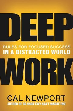
  • Deep Work, Cal Newport
  • $100M Offers, Alex Hormozi
  • $100M Leads, Alex Hormozi
  • Color and Light, James Gurney
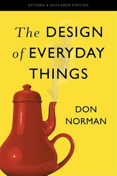
  • The Design of Everyday Things, Don Norman
  • Refactoring UI, Adam Wathan & Steve Schoger
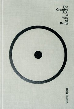
  • The Creative Act, Rick Rubin
Readingsspecific · stablepages/about.tsx

His books, covers only, four to a row; a cover not yet in is drawn from the title.

Tools

  • FigmaInterfaces & systems
  • PaperDesigning with agents
  • ClaudePrototypes in code
  • CodexPrototypes in code
  • LinearIssues & roadmap
  • Figma WeaveAI image & video
  • PhotoshopRetouching
  • After EffectsMotion
Rowspecific · stablepages/about.tsx

About's row: its label in the left column, what it holds in the right one. Here the tools, two to a line.

  • FigmaInterfaces & systems
  • PaperDesigning with agents
  • ClaudePrototypes in code
  • CodexPrototypes in code
  • LinearIssues & roadmap
  • Figma WeaveAI image & video
  • PhotoshopRetouching
  • After EffectsMotion
ToolGridspecific · stablesite/tool-grid.tsx

The tools with their logos as they come, and what each is for. As many columns as the room allows: on the agent's pages.

Paris, France

Placespecific · stablepages/about.tsx

About's last line, under a hairline: where he is, the time zone, and the time there.

ParisLocalZone
LocalTime
LocalTime, LocalZonespecific · stableabout/local-time.tsx

The time in Paris and the zone's name with its offset, worked out in the browser: nothing until the page has loaded.

Text

Every page

I'm Theo, a product designer in Paris. I designed BenchBee and Zenask, from their interfaces to their design systems, and I co-founded Make Me Grow, where we now build our own software.

RichTextbase · stablesite/rich-text.tsx

Text with company names and their logos inline, as About's first paragraph.

BenchBeeLinked
ZenaskPlain
VLSLinked
BrandMentionbase · stablesite/rich-text.tsx

A company's name with its logo: a link to its site where it has one, greyed under the pointer.

Product, Design system, WebDraft
Tagbase · stablesite/primitives.tsx

A small label in the grey: a project's services, a writing's subjects, Draft.

Writings

SectionTitlebase · stablesite/primitives.tsx

A section's heading in a writing and on the agent's pages: 22px, 24 from tablets up.

DottedRulebase · stablesite/primitives.tsx

2px dashes, 1px thick, every 5px, in the rule's grey: between rows and over groups.

Columnbase · stablesite/primitives.tsx

The page: its text column centred, with 16px gutters; pictures run wider.

Footer

Every page

Open to full-time roles.

Contact
Theo ToussaintProduct designer
Paris © 2026
FooterCardspecific · stablesite/footer-card.tsx

What closes every page: his status, Contact, then the ticket, its Admit one stub to tear off. Shown whole: its tear is drawn in WebGL over the window.

Barcodebase · stablesite/ticket-stub.tsx

Bars drawn from his name, always the same, on the ticket's stub. Nothing to scan.
Media

The pictures and videos of case studies and writings, the About page's photos, the hairline figures, and how sketch mode draws a section.

Source
Pictures, video and the sketch: their sheets in the catalog; pictures are listed with their reason in scripts/design-exceptions.mjs
Checked by
catalog --check (every component here has its sheet) and design:audit (no raw colour, size or radius), ESLint (<img> only in the listed files)

Pictures

Case studies, writings

Caption to write

A picture and its caption
Key decision, before and after
Before its picture
Mediabase · stablesite/media.tsx

A section's picture: the column's width in a case study, 1040px at most in a writing; its caption close under it. Without its file yet, the grey with its label.

Caption to write

Caption to write

Two to a row
Three to a row
MediaGridbase · stablesite/media.tsx

Pictures side by side within the same width, two or three to a row; one above the other on a phone.

Opening

Case studies
An animated cover, looping
Make Me Grow hero shot
Before its picture
Herobase · stablesite/media.tsx

A case study's opening picture, between its title and its facts, in a 720:468 proportion; a video runs at 16:9 and loops, as an animated cover.

Creating a consultant from a CV instead of filling in a form.

On a screen, as a row

AfterCaption to write

In a phone
Demobase · stablesite/media.tsx

An interaction shown as it moves: a looping video, no sound, no controls, of a piece of the interface on a square of the card grey, or in a phone. With a title and a line beside it, at its foot, as a row.

Strip

Case studies
  • Screen 1
  • Screen 2
  • Screen 3
  • Screen 4
Carouselbase · stablesite/media.tsx

Tall screens in a strip across the page, its edges fading where screens go on. Swiped on a phone; dragged, wheeled or stepped with the arrows with a mouse.

Article

Case studies, writings

I redesigned the whole interface of a B2B platform where IT consultancies share consultants between missions, and built its design system.

Caption to write

ArticleColumnbase · stablesite/media.tsx

The reading column of case studies and writings: 560px of text, its pictures breaking out of it, centred on it.

Theo redesigned BenchBee end-to-end: onboarding for both personas, dashboard rebuilt around retention, and all core flows. He understood the product and challenges, then designed around them. Clear comms, on time.
BenchBee
Testimonialbase · stablesite/media.tsx

What a client said, at the text's measure: the last word of a case study.

To writeWhat you'd do differently today.

Todobase · stablesite/media.tsx

Marks a part of a case study still to come.

Photos

About
  • Drawings
  • On site
  • Shows
  • Friends
PhotoStripspecific · stableabout/photo-strip.tsx

About's photos, square, across the window, going round in a loop. They don't move by themselves: dragged sideways, then thrown.

Figures

Home, writings, contact, drafts
Shelf, on the home page
Persona, in the design systems guide
Writing, before a draft's code
Document, the fit check's reading
HairlineFigurebase · stablesite/hairline-figure.tsx

Isometric line figures that answer the pointer (lucasmarkes/hairline), loaded as they are from public/hairline, each cropped to its part of the drawing.

Sketch mode

Home
Theo Toussaint

Theo Toussaint designs
polished products, with design systems written for AI agents.

Teams ship faster than ever with AI. Keeping a product polished at that speed is the hard part. It's what all my work is about, and this whole site was built that way.

Press to ask about Theo

WireSketchspecific · stablesite/wireframe.tsx

Sketch mode, opened from the radial toolkit on the home page: each section outlined in pen, named, measured, its note beside it. Here, the opening.

Music

The player behind Music in the nav. The site draws it; the music streams from Spotify. Here it holds a still track: nothing loads, nothing plays.

Source
The player and its engine: their sheets in the catalog
Checked by
catalog --check (every component here has its sheet) and design:audit (no raw colour, size or radius)

Player

The nav's Music, the radial toolkit

On repeat while designing

Playlist

0:11−0:19
Paused

On repeat while designing

Playlist

0:17−0:12
Playing, shuffled, repeating the playlist

On repeat while designing

Playlist

0:06−0:23
Repeating this track
MusicPlayerspecific · stablesite/music-player.tsx

280px square in the composer's glass shell. The cover fills it and blurs into its lower half; the track's waveform is the scrubber, the part heard in white; shuffle and repeat take a dot while on. Here a picture of the site stands in for the cover.

On repeat while designing

Playlist

0:11−0:19
MusicPanelspecific · stablesite/music.tsx

The player opening under the nav, its top right corner beside the tools: 180ms, from 97% and 6px higher. Escape or a click elsewhere closes it; the music keeps playing.

On repeat while designing

Playlist

-:---:--
Before the playlist is read
MusicPlayerspecific · stablesite/music-player.tsx

Opened the first time, before the playlist is read: only play, the waveform in dots until the track's sound is measured.

In the player and the rings

2 components
On the page
On the cover
SpotifyCreditspecific · stablesite/music-player.tsx

Spotify's logo, as its terms ask, linking to the track on Spotify (the playlist before one plays). Grey on the page, ink on hover; on the cover, white on a translucent circle.

Off
Playing
At its size
LiveWavespecific · stablesite/music.tsx

Five bars in the nav's music ring while music plays: the centre on the beat, the two beside it on the swell, the ends dots. Before the track's sound is measured it sways evenly: point at it. The radial toolkit's ring draws it with 1.5px bars.

Chat

Asking Theo's agent: the composer under every page and on /chat, the conversation, the reasoning shown while it answers, and the cards it places.

Source
The composer, the conversation, the answer cards: their sheets in the catalog
Checked by
catalog --check (every component here has its sheet) and design:audit (no raw colour, size or radius)

Composer

Every page, /chat
    What did Theo do at BenchBee?

    Empty
    Open, no project picked
    Typed
    With a file
    Composerspecific · stablechat/composer.tsx

    Wherever a question is asked. Frosted glass, the card 4px in; the placeholder turns through questions worth asking and Tab writes one in. The project row opens with it on the pages and stays open on /chat. Files are picked, pasted or dropped on the card.

    ChatBarbase · stablesite/chat-bar.tsx

    The composer pinned to the bottom of every page, over a progressive blur, the project row folded until it's used. Typing anywhere on the page writes into it. On a phone it folds into one line: the +, the question, the microphone.

    Closed

    Talk about

    BenchBee
    Zenask
    Bonap
    Make Me Grow
    Anything
    Open
    ProjectPickerbase · stablechat/composer-parts.tsx

    What the question is about, sent with it. Its menu opens over the trigger, the picked subject at the bottom where the trigger was.

    Closed

    Get the answer as

    A page designed live
    A chat reply
    Open
    ModePickerbase · stablechat/composer-parts.tsx

    How the agent answers: a reply in the conversation, or a page it designs. The project menu's twin, at the other end of the card.

    Idle
    DictationButtonbase · stablechat/composer-parts.tsx

    The microphone, in the card's tools. Pressed, the browser's own speech recognition listens, and the tools give way to the recording bar.

    What did Theo do at BenchBee?

    DictationBarbase · stablechat/composer-parts.tsx

    While it listens: the voice's waveform across the card, newest on the right, a quiet moment a dot; the cross puts the field back, the check keeps what was said.

    How does Theo use AI when designing?
    Keyboard
    How does Theo use AI when designing?
    Touch screen
    HintLinespecific · stablechat/question-hints.tsx

    The placeholder: the question shown now and the key that takes it, Tab with a keyboard, an arrow on a touch screen.

    Writing in
    StreamCopyspecific · stablechat/question-hints.tsx

    A question taken with Tab, written in as a chat streams its answer: about seventy characters a second, the newest words in the pen blue, then ink.

    FullScreenEditorspecific · stablechat/composer-full.tsx

    On a phone, past about three lines: the question full screen over what's visible above the keyboard, collapse at the top, send at the bottom. It writes the composer's own text.

    Point at it
    DropHeatspecific · stablechat/drop-heat.tsx

    Files dragged over the card: waves of heat in blues leave the pointer and spread to its edges, its stroke in the drop blue. Here, pointing at the card stands for the drag. None with reduced motion.

    Asking about a selection

    The pages, /chat

    Teams ship faster than ever with AI. Ask about thisKeeping a product polished at that speed is the hard part. It's what all my work is about, and this whole site was built that way.

    SelectionAskspecific · stablesite/selection-ask.tsx

    Over words selected on a page, in the site's blue: puts them in the chat bar as a quote and opens it. Over the selection's first line with a mouse, under its last on a phone.

      SelectionChipsspecific · stablechat/selection-chips.tsx

      What was asked about, as quotes in the composer's card over the field: one line, small, then +N for the rest. They go with the next question.

      • Keeping a product polished at that speed…
      • Interfaces made on demand

      Tell me more about this

      SentSelectionspecific · stablechat/selection-chips.tsx

      Over a question in the conversation: what was selected when it was asked, smaller, without the crosses.

      Conversation

      /chat

      Ask about Theo

      Answers come from Theo's own notes. When something isn't there, it says so.

      ChatWelcomespecific · stablechat/chat-welcome.tsx

      /chat before the first question: Theo's photo over the page's title and line, as the home page's hero sets them, then the questions to start with as the FAQ's rows. A phone has them over its composer instead.

      StarterQuestionsspecific · stablechat/starters.tsx

      On a phone, over the docked composer while the conversation is empty: one question a row, its icon saying what it's about. A tap asks it.

      How does Theo use AI when designing?

      Theo has used AI since ChatGPT launched, and Claude every day now. He prototypes several user journeys with it, tests them, and only then polishes the winner to the pixel in Figma. He builds in code with AI, in React, but doesn't hand-write code.

      His Contra × Mobbin winner, Drift, is a good example: Claude for the requirements, Mobbin for research, Figma for design, then Claude Code and Vercel to ship a working prototype. More in his guide.

      ChatUserMessage, ChatAssistantMessagespecific · stablechat/chat-turns.tsx

      A turn: the question on the right in its grey bubble; the answer under it, its reasoning folded on one line, the words at 16px (MarkdownText, messages.tsx), then a way to the same answer as a page and what to ask next behind ↳.

      What did Theo do at BenchBee?

      BenchBee is a UK B2B SaaS where IT consultancies share consultants who are between missions. Theo redesigned the entire interface. He tested new user journeys, ran QA, designed the landing page and built the design system.

      • Putting benched consultants back on billable workBenchBee
      WorkTilespecific · stablechat/chat-turns.tsx

      The projects an answer shows, as the home page draws its work: one at 352px, two or more side by side, captioned under the cover.

      Reasoning

      /chat, the agent's pages
      Folded
      1. They're asking how Theo works with AI. Checking his workflow in the profile.

      2. Claude to prototype several journeys and test them, then Figma to polish the winner to the pixel.

      3. Drift, his Contra × Mobbin winner, shows the whole chain end to end. His guide covers it.

      4. Suggested follow-upssuggest_questions

      Unfolded
      1. They want to know what Theo did at BenchBee. Pulling it from his profile.

      2. Scope: the whole interface redesign, the journeys he tested, QA, the landing page and the design system.

      Thinking
      A tool at work
      ChainOfThoughtspecific · stablechat/chain-of-thought.tsx

      The answer's reasoning, one step a paragraph, and the tools it calls. Open while the agent thinks, folded once the answer starts; the header counts the steps and stacks the projects and tools named, with their marks.

      1. Reading the job description
      2. Matching it with Theo's projects
      3. Looking for gaps, honestly
      4. Writing the report
      Reading
      1. Reading the job description
      2. Matching it with Theo's projects
      3. Looking for gaps, honestly
      4. Writing the report
      Looking for gaps
      1. Reading the job description
      2. Matching it with Theo's projects
      3. Looking for gaps, honestly
      4. Writing the report
      Done
      AnalysisStepsspecific · stablechat/analysis-steps.tsx

      While a fit check runs, before the report: four steps ticking through, the last waiting for the answer.

      Cards in an answer

      /chat
      PathLive eventsProduct design
      1. ≈2021Roadie on event sitesFlight cases and cables first, then technician.
      2. Nov 2022First job abroad, MSC World EuropaRan the network for the video mapping on the ship's hull, at its naming in Doha.
      3. Jun 2023Projectionist, Mont-Saint-Michel Millennium showOne of two projectionists on a 36-projector mapping, hired by VLS.
      4. Jul 2023Projection mapping, Pan Arab GamesVideo mapping for the opening ceremony in Algiers, with VLS.
      5. ≈2023First interfacesSelf-taught on Figma, first for small e-commerce brands.
      6. 2024Four months in DohaDar Al Maghreb pavilion, Qatar–Morocco Year of Culture.
      7. Oct 2024Immersive show, Saint-Sulpice churchParis Cœur de Lumières, video mapping inside the church, between two stints in Doha.
      8. Feb 2026ZenaskDesigned the tool its conversational agents were built with, and its design system.
      9. Mar 2026BenchBeeRedesigned the whole interface and built its design system, until October 2026.
      10. Apr 20261st place, Contra × Mobbin challengeDesigned and shipped a working prototype in days.
      11. NowMake Me GrowCo-founded a four-person agency. After e-commerce work and internal tools, we now build software for VAE organisations, shaped by user interviews.
      TimelineToolspecific · stablechat/visuals.tsx

      Theo's path, from the site's timeline: the years in tabular figures, live events in grey, product design in ink.

      Fit reportProduct Designer at Sample company

      Partial fit.

      The core of the role, user journeys and a design system, is exactly Theo's work. The stretch is the in-house experience and the spoken English the description asks for.

      Stretches

      • About three years of interface design, mostly freelance, so less time inside a structured in-house team.
      • Comfortable in written English; spoken English on calls is still a work in progress.

      Questions

      • Is the role fully remote?
      • Who would Theo work with day to day?
      FitReportToolspecific · stablechat/visuals.tsx

      A fit check's answer: the verdict, what matches with the evidence, the stretches, the questions to ask. Shown with the demo's sample report.

      Open to full-time roles.

      Contact
      Theo ToussaintProduct designer
      Paris © 2026
      ContactToolspecific · stablechat/visuals.tsx

      The site's identity with his status, then the ways to reach him.

      PageLinkspecific · stablechat/messages.tsx

      A page the agent designed or revised, seen from the conversation: its name, what changed, the way to it.

      Contact and fit check

      The Contact page's two cards, the message and the fit check, in their states; the paper plane a sent message folds into; the code field of a writing still being written.

      Source
      The contact form, the fit check, the paper plane, the draft gate: their sheets in the catalog
      Checked by
      catalog --check (every component here has its sheet) and design:audit (no raw colour, size or radius)

      Message

      Contact

      Let's talk.

      Tell me about the role and the team: it goes straight to my inbox, and I reply by email.

      Empty

      Let's talk.

      Tell me about the role and the team: it goes straight to my inbox, and I reply by email.

      Written

      Let's talk.

      Tell me about the role and the team: it goes straight to my inbox, and I reply by email.

      Drop to attach
      Files held over it

      Let's talk.

      Tell me about the role and the team: it goes straight to my inbox, and I reply by email.

      • PDFjob-description.pdf239 KB
      • moodboard.png1.1 MB
      Files attached

      Let's talk.

      Tell me about the role and the team: it goes straight to my inbox, and I reply by email.

      Sending, without the plane

      Let's talk.

      Tell me about the role and the team: it goes straight to my inbox, and I reply by email.

      Not sent

      On its way.

      It's in my inbox. I'll reply to alex@company.com.

      Sent, the plane gone

      Hiring for a role?

      Drop the job description for an honest read on whether I fit, including where I don't.

      Read by an AI

      On the fit check
      ContactFormspecific · stablecontact/contact-form.tsx

      The Contact page: the hero's title and line, then the card, an email over the message, files attached with Attach or dropped on it. Send, or Ctrl or ⌘ + Enter. The line ends on the way to the fit check.

      Fit check

      Contact, Check the fit

      Read by an AI

      Drop
      Paste the text

      Read by an AI

      A file held over
      A file it can't take
      FitCheckspecific · stablesite/fit-check.tsx

      The second card: a job description dropped or browsed (FitDrop), or pasted as text. A file held over the zone darkens its edge; under a real drag, the composer's blue glow spreads beneath it.

      Reading

      First read

      Read by an AI

      Reading
      Thinking
      1. Read job-description.pdf

      2. Read Theo's profile

      3. Owns end-to-end product design

      4. Prototypes and tests before polishing

      5. Strong UI craft

      6. About three years of interface design, mostly freelance, so less time inside a structured in-house team.

      7. Comfortable in written English; spoken English on calls is still a work in progress.

      Read by an AI

      Thinking
      FitReadingspecific · stablesite/fit-reading.tsx

      The run in the card (FitRun) while the agent works: the document read by a line of light, down, back up and down again, then its thinking, a line per step, each match with its proof.

      Partial fit.

      The core of the role, user journeys and a design system, is exactly Theo's work. The stretch is the in-house experience and the spoken English the description asks for.

      Stretches

      • About three years of interface design, mostly freelance, so less time inside a structured in-house team.
      • Comfortable in written English; spoken English on calls is still a work in progress.

      Questions

      • Is the role fully remote?
      • Who would Theo work with day to day?
      Report
      FitResultspecific · stablesite/fit-result.tsx

      The report on the card's surface: the verdict, the summary with the marker over what matches and a dotted line under the stretches, each match a row to its proof, then the questions. Under it, Check another role or Write to me about it.

      Case study
      Writing
      Another site
      No link
      ProofPicturespecific · stablesite/fit-proof.tsx

      A match's proof, 4:3: a case study's cover, a writing's page drawn with its title, another site's picture, or a dashed tile without a link. 88px in the report, the same tile at 28px in the thinking's lines.

      Paper plane

      Contact, once sent
      Tilting back with the card
      Folding
      Folded, waiting for the server
      PlaneStagespecific · stablecontact/paper-plane.tsx

      Sending folds the card into a paper plane, drawn with Three.js over the window: it tilts back with the card, folds, waits for the server, then flies off; if the message doesn't go, it unfolds.

      Draft gate

      Writings in progress

      Interfaces made on demand

      Still being written.

      Enter the code to read the draft.

      Empty

      Interfaces made on demand

      Still being written.

      Enter the code to read the draft.

      1
      2
      3
      4
      5
      6

      That's not the code.

      A wrong code
      DraftGatespecific · stablesite/draft-gate.tsx

      A writing still being written: a notebook writing itself, and the six-digit code that opens the draft. A wrong code says so and clears; the right one sweeps across the slots and the writing opens.

      Agent

      What the agent places: the cards in a chat answer, the page it composes from the site's components, its cursor, and the selections drawn over a page.

      Source
      The agent's pieces, status experimental in the catalog
      Checked by
      catalog --check (every component here has its sheet) and design:audit (no raw colour, size or radius)

      In an answer

      Chat, the agent's pages
      Fit reportProduct Designer at Sample company

      Partial fit.

      The core of the role, user journeys and a design system, is exactly Theo's work. The stretch is the in-house experience and the spoken English the description asks for.

      Stretches

      • About three years of interface design, mostly freelance, so less time inside a structured in-house team.
      • Comfortable in written English; spoken English on calls is still a work in progress.

      Questions

      • Is the role fully remote?
      • Who would Theo work with day to day?
      FitReportCardspecific · stablechat/visuals.tsx

      The fit report in a chat answer (show_fit_report, FitReportTool): the verdict in one line, the role and the company, the summary, then where Theo matches, where he'd be stretching, and what he'd want to know.

      Work
      BenchBeePutting benched consultants back on billable work
      ZenaskAI agents selling in a coach's DMs, and learning what to sell next
      ProjectsToolspecific · stablechat/visuals.tsx

      The projects the agent names (show_projects), as the home page shows them: one picture each, none repeated.

      Theo Toussaint

      Theo Toussaint

      Open to full-time roles
      His status
      Theo Toussaint

      Theo Toussaint

      Ask Theo about compensation directly.
      The agent's note
      ContactToolspecific · stablechat/visuals.tsx

      The ways to reach Theo (show_contact): his identity with his status, or the agent's note, then the contact pill and his links.

      PathLive eventsProduct design
      1. ≈2021Roadie on event sitesFlight cases and cables first, then technician.
      2. Nov 2022First job abroad, MSC World EuropaRan the network for the video mapping on the ship's hull, at its naming in Doha.
      3. Jun 2023Projectionist, Mont-Saint-Michel Millennium showOne of two projectionists on a 36-projector mapping, hired by VLS.
      4. Jul 2023Projection mapping, Pan Arab GamesVideo mapping for the opening ceremony in Algiers, with VLS.
      5. ≈2023First interfacesSelf-taught on Figma, first for small e-commerce brands.
      6. 2024Four months in DohaDar Al Maghreb pavilion, Qatar–Morocco Year of Culture.
      7. Oct 2024Immersive show, Saint-Sulpice churchParis Cœur de Lumières, video mapping inside the church, between two stints in Doha.
      8. Feb 2026ZenaskDesigned the tool its conversational agents were built with, and its design system.
      9. Mar 2026BenchBeeRedesigned the whole interface and built its design system, until October 2026.
      10. Apr 20261st place, Contra × Mobbin challengeDesigned and shipped a working prototype in days.
      11. NowMake Me GrowCo-founded a four-person agency. After e-commerce work and internal tools, we now build software for VAE organisations, shaped by user interviews.
      TimelineToolspecific · stablechat/visuals.tsx

      Theo's path (show_timeline): live events in grey, then product design in ink, the years on the left. All of it, or one of the two.

      PathLive eventsProduct design
      1. ≈2023First interfacesSelf-taught on Figma, first for small e-commerce brands.
      2. Feb 2026ZenaskDesigned the tool its conversational agents were built with, and its design system.
      3. Mar 2026BenchBeeRedesigned the whole interface and built its design system, until October 2026.
      4. Apr 20261st place, Contra × Mobbin challengeDesigned and shipped a working prototype in days.
      5. NowMake Me GrowCo-founded a four-person agency. After e-commerce work and internal tools, we now build software for VAE organisations, shaped by user interviews.
      show_timeline, product design only
      AgentCardspecific · experimentaldesign/agent-card.tsx

      Any of these cards from a tool's name and input, as the chat's tool call would give them. The agent's pages place the timeline, the contact card and the fit report through it (place_timeline, place_contact, place_fit_report).

      A composed page

      Design mode's agent, /p pages

      The design system Theo built at BenchBee

      Design system, Product design

      As its product designer, Theo redesigned BenchBee's whole interface and built the design system it runs on.

      Role
      Product Designer
      Service
      Product design
      Design system
      QA
      Landing page
      Illustration
      Year
      To confirm

      Made for agents too

      Design systems are at the core of Theo's work, and he now builds them to be read by AI agents as well as by people.

      An agent can't guess what a value is for, so names say what things mean, rules are written next to the components, and components stay predictable.

      AgentPageBodyspecific · experimentalsite/agent-blocks.tsx

      The page the agent composes, in the case studies' column, under room for the nav: each component it placed, rendered from its tool call by BlockContent (nothing when the input doesn't validate). The demo's page for one of the site's questions.

      BuiltBlockspecific · experimentalsite/agent-skeleton.tsx

      A component as the agent places it: while it writes the input, the skeleton of a component of its kind, read from the component itself (a bar for each line of text as it breaks, a block for each picture), one light crossing it, framed as a selected component in Figma in the agent's purple; then the component.

      1. 1Hero
      2. 2Media
      3. 3ProjectFacts
      4. 4Section
      5. 5ProjectRow
      AgentPlanspecific · experimentalsite/agent-choosing.tsx

      The components it picked, in order, beside the page while it builds: the one it's placing shimmering, those placed ticked. Before it, while it thinks, the components it can place come up drawn small and it selects them as a person would in Figma.

      Cursor and selections

      Design mode's agent, /p pages, every page
      Agent · Placing Section
      Placing Section
      Agent · Selecting the page
      Selecting the page
      Agent · Done
      Done
      AgentCursorGraphicspecific · experimentalsite/agent-cursor.tsx

      The agent's cursor, as Figma draws a collaborator's: the arrow and a tag in the components' purple, saying what it's doing.

      Blue
      CursorArrowspecific · experimentalsite/agent-cursor.tsx

      The site's own arrow, its white outline and soft shadow, in a colour: the visitor's cursor, Theo's and the marker's, in the blue.

      Made for agents too

      Design systems are at the core of Theo's work, and he now builds them to be read by AI agents as well as by people.

      An agent can't guess what a value is for, so names say what things mean, rules are written next to the components, and components stay predictable.

      PageSelectionspecific · experimentalpages/page-selection.tsx

      Before a new page replaces the one open at /p, the agent drags a selection over it from its top left, as a marquee in Figma: the page's name over it, its size under it, then it's deleted.

      I redesigned the whole interface of a B2B platform where IT consultancies share consultants between missions, and built its design system.

      A marquee being drawn

      I redesigned the whole interface of a B2B platform where IT consultancies share consultants between missions, and built its design system.

      One thing selected

      I redesigned the whole interface of a B2B platform where IT consultancies share consultants between missions, and built its design system.

      Several selected
      PageSelectspecific · stablesite/page-select.tsx

      The visitor selecting on a page as in Figma: a drag from empty space draws a marquee, Shift or Cmd + click takes one thing in or out. What's selected is framed in the blue, with Ask about this, which puts it in the chat bar.

      Secrets and play

      The site's five hidden features, collected on a shelf; and the two cursors, the visitor's and Theo's.

      Source
      The secrets and the cursors: their sheets in the catalog
      Checked by
      catalog --check (every component here has its sheet) and design:audit (no raw colour, size or radius)

      Secrets

      Home

      Collect the 5 pieces hidden on this site

      0/5 collected

      Tap or hover a box if you're stuck.

      Open Design mode, at the top right: the site opens as its own design file.

      Sealed, one pointed at

      Collect the 5 pieces hidden on this site

      2/5 collected

      Tap or hover a box if you're stuck.

      One open, one ajar
      SecretsShelfspecific · stablesecrets/secrets-shelf.tsx

      Five boxes on a shelf, one per hidden feature. A sealed box shows, under the pointer, a short video of where its feature is, and pressing it goes there. Using the feature leaves its box ajar, glowing; pressing it then opens it, with a sound.

      This site has a design system of its own: flip design mode to see it.
      SecretPointerspecific · stablesecrets/secret-pointer.tsx

      After a box sends the visitor to its feature's page, rings go out from the feature once it shows. It draws nothing itself: the rings are the feature's own.

      Cursors

      Every page; Theo's on Home
      On a work tile

      I redesigned the whole interface of a B2B platform where IT consultancies share consultants between missions, and built its design system.

      Resting on words
      On a link that leaves the site
      CursorHintspecific · stablesite/cursor-hint.tsx

      The visitor's cursor, drawn by the site: the arrow in the blue, a caret on words. By it, in a name tag, what the thing under it does; resting on words, how to select them; on a link that leaves the site, a picture of where it goes.

      Resting on a tile
      Waving hello
      His marquee

      I redesigned the whole interface of a B2B platform where IT consultancies share consultants between missions, and built its design system.

      Reading a few words
      TheoCursorspecific · stablesite/theo-cursor.tsx

      A scripted cursor labelled Theo on the home page, like a collaborator's in a shared Figma file: it rests on a work tile, waves hello by his photo, draws a small marquee round something, highlights a few words as if reading. It keeps out of the visitor's way.

      Built for agents

      The agents that build this site read this system, follow it, and write down what it lacks.

      An agent at work

      Given only the written files
      Asked

      “Add an error line under the fit check's drop zone.”

      Read in DESIGN.mdAn error line → text-label-14 text-destructive, with role="alert"
      Wrote
      An error linespecific · stablesite/fit-check.tsx

      The system has the answer: the agent uses its names, and npm run check's 6 checks pass.

      Asked

      “Add a dropdown to filter the work by role.”

      Searched catalog.jsonselect, dropdown, filter → no component
      Wrote in GAPS.md
      Open
      - Select / filter control: a dropdown to filter the work by role, its component and its states (2026-10-24, needed by the home page)
      A filter dropdownGAPS.md

      The system has no answer: the agent builds nothing around it, it logs the gap, and Theo decides.

      Read more

      Writings
        What did Theo do at BenchBee?